Introduction _
The Challenge _
Expertise and Services
The logo needed to clearly represent the company’s focus on regulatory compliance and business growth, highlighting their deep understanding of these areas.
Company Values
Communicating their core values—integrity, professionalism, and commitment to customer success—was essential for building trust and attracting the right clientele.
Visual Appeal
The logo design needed to reflect the company’s professional image, instilling confidence and reliability while encouraging businesses to trust RTO Services with their regulatory compliance needs.
User Experience
The logo needed to stand out from competitors and establish a unique and memorable brand identity for RTO Services.
The Solution _
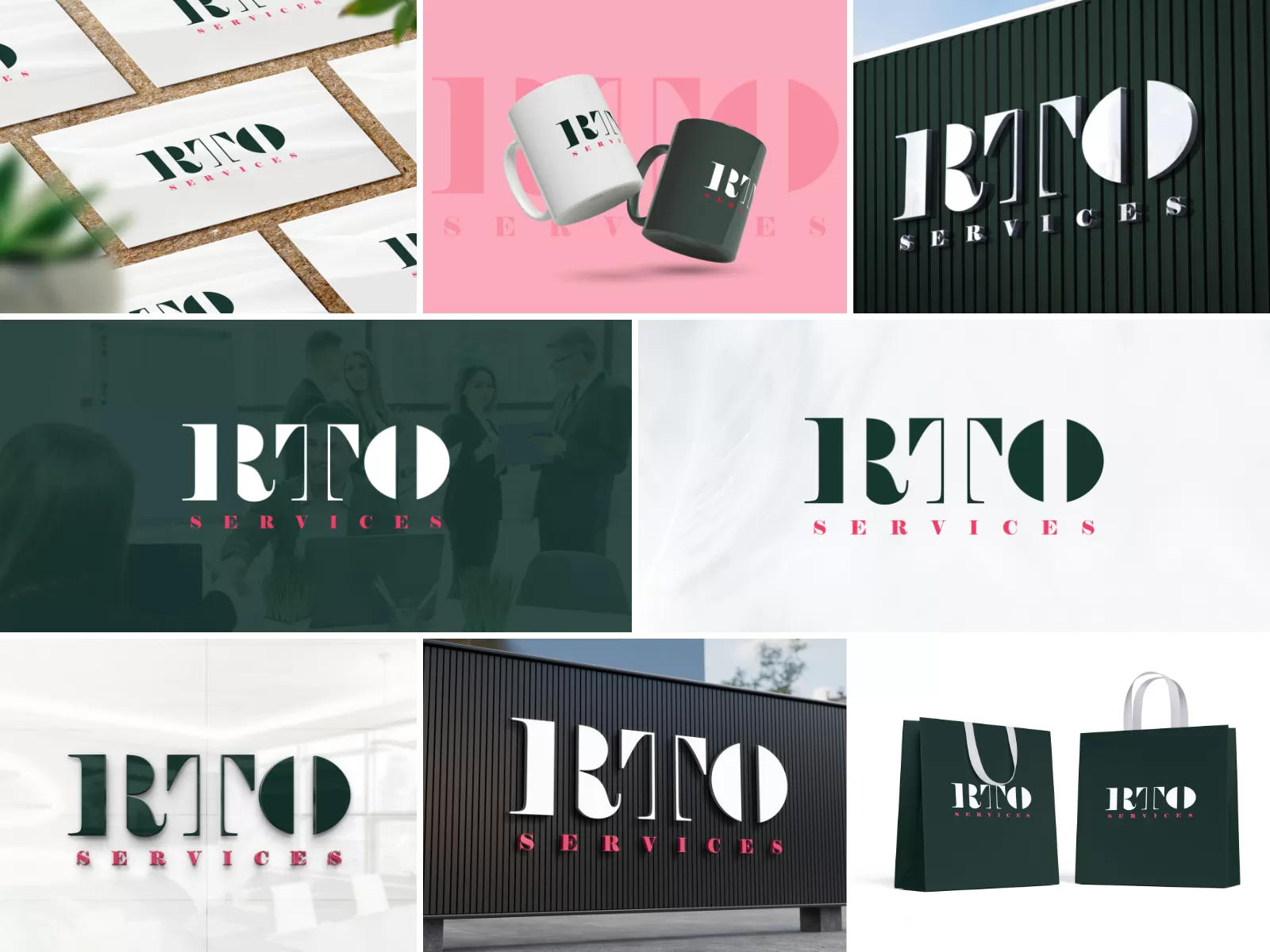
Colour Palette
The logo uses a green and pink colour scheme. Green often represents growth, harmony, and safety, while pink symbolises trust, compassion, and innovation. Together, they create a balanced and approachable aesthetic.
Typography
The logo features a clean and modern sans-serif typeface for the "RTO" portion, conveying professionalism and efficiency. The "SERVICES" text is in a lighter weight, adding a touch of dynamism and approachability.
Symbolism
The "RTO" letters themselves incorporate subtle design elements that enhance brand recognition.
Simplicity
The logo is designed to be simple and memorable, ensuring businesses can easily recognise and recall the brand.
Results and Impact _
Enhanced Brand Image
The professional and modern logo strengthens RTO Services’ brand identity, positioning them as a trusted and reliable partner for regulatory compliance.
Improved Customer Perception
The logo effectively communicates the company’s values and expertise, fostering trust and creating a positive impression.
Increased Brand Awareness
The unique and memorable logo helps RTO Services stand out from competitors, reinforcing a strong brand identity.
Conclusion_
We're listening – drop us a line_
Location
Level 1, 454 Collins Street,
Melbourne, VIC 3000
