Introduction _
A leading educational institution specialising in automotive and business training programmes. With a strong commitment to providing students with the tools to succeed in these dynamic industries, the institute sought a logo that would reflect their values of innovation, excellence, and forward-thinking education. This case study explores the redesign of their logo, focusing on how it was transformed to effectively communicate their mission, expertise, and dedication to empowering future leaders in the automotive and business sectors.
The Challenge _
They faced several challenges with their previous logo:
Outdated Aesthetic
The old logo, which used red and black, felt overly traditional and lacked the modern, innovative flair that the institute stands for.
Lack of Visual Connection to Education
The previous design didn’t sufficiently communicate the educational aspect of the brand, focusing more on generic shapes without any connection to the automotive or business sectors.
Need for Brand Differentiation
As the education sector becomes increasingly competitive, they needed a logo that would distinguish them from other institutions while reflecting their unique approach to teaching and their commitment to excellence.
The Solution _
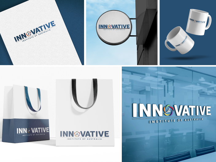
Colour Palette
The new logo adopts a modern and professional colour scheme that includes shades of blue and green. The primary blue (RGB: 40, 80, 114) communicates trust, professionalism, and expertise, while the secondary colours in the symbol represents growth, innovation, and the institute’s focus on nurturing students. These colours help convey the institute’s modern, forward-thinking approach while maintaining a sense of reliability and stability.
Typography
The logo features two distinct fonts: Habanera Rounded and Poppins. Habanera Rounded offers a modern and approachable feel, aligning with the institute’s focus on providing an inclusive and student-friendly environment. Poppins, with its clean, geometric design, adds professionalism and strength, reinforcing the institute's reputation as a serious and innovative educational institution.
Symbolism
The updated logo includes a subtle graphic element that blends both the automotive and business aspects of the institute’s programmes. The clean, structured design paired with the refined colour palette creates an image that is both dynamic and forward-thinking, appealing to students pursuing careers in these industries.
Composition
The layout of the logo is balanced and straightforward, with the graphic element positioned in the centre of the name of the institute. This flexible composition ensures the logo remains versatile across various media while maintaining visual coherence.
Results and Impact _
Enhanced Brand Perception
The new logo communicates professionalism, innovation, and excellence, aligning with the educational institute’s mission to provide high-quality education and training. It positions the institute as a forward-looking institution, capable of meeting the needs of students in an ever-evolving world.
Improved Brand Recognition
The use of blue, paired with other colours with modern typography, creates a memorable and visually appealing logo that stands out in the competitive education market. The updated design also enhances their visibility and recognition across both digital and print platforms.
Clearer Communication of Values
The logo effectively communicates the educational institute’s commitment to innovation, growth, and student success. The colour palette and typography choices reinforce the institute’s approach to education—dynamic, accessible, and future-oriented.
Increased Trust and Credibility
The updated design speaks to the quality of education and training that they provide. The professional aesthetic and modern elements inspire confidence in potential students, showcasing the institute as an authority in automotive and business education.
Conclusion_
We're listening – drop us a line_
Location
Level 1, 454 Collins Street,
Melbourne, VIC 3000
